Omnica: The Design System
Context
When I joined the project, I inherited a super simple UI kit that wasn't sufficient for the product's needs. With plans to grow the design team, I decided to start from scratch and develop a comprehensive design system. This foundation would ensure consistency, scalability, and smooth collaboration as the team expanded.
Mission
To unify design decision-making, visual language, ui/ux patterns, and design-to-dev workflows under one scalable framework — Omnica Design System.
Goals
Establish a cross-platform design system shared by all teams
Define clear UX Laws and principles for decision-making
Create UX writing guides for consistent tone and microcopy
Reduce design-to-development friction and UI defects
Process
Foundation & Audit
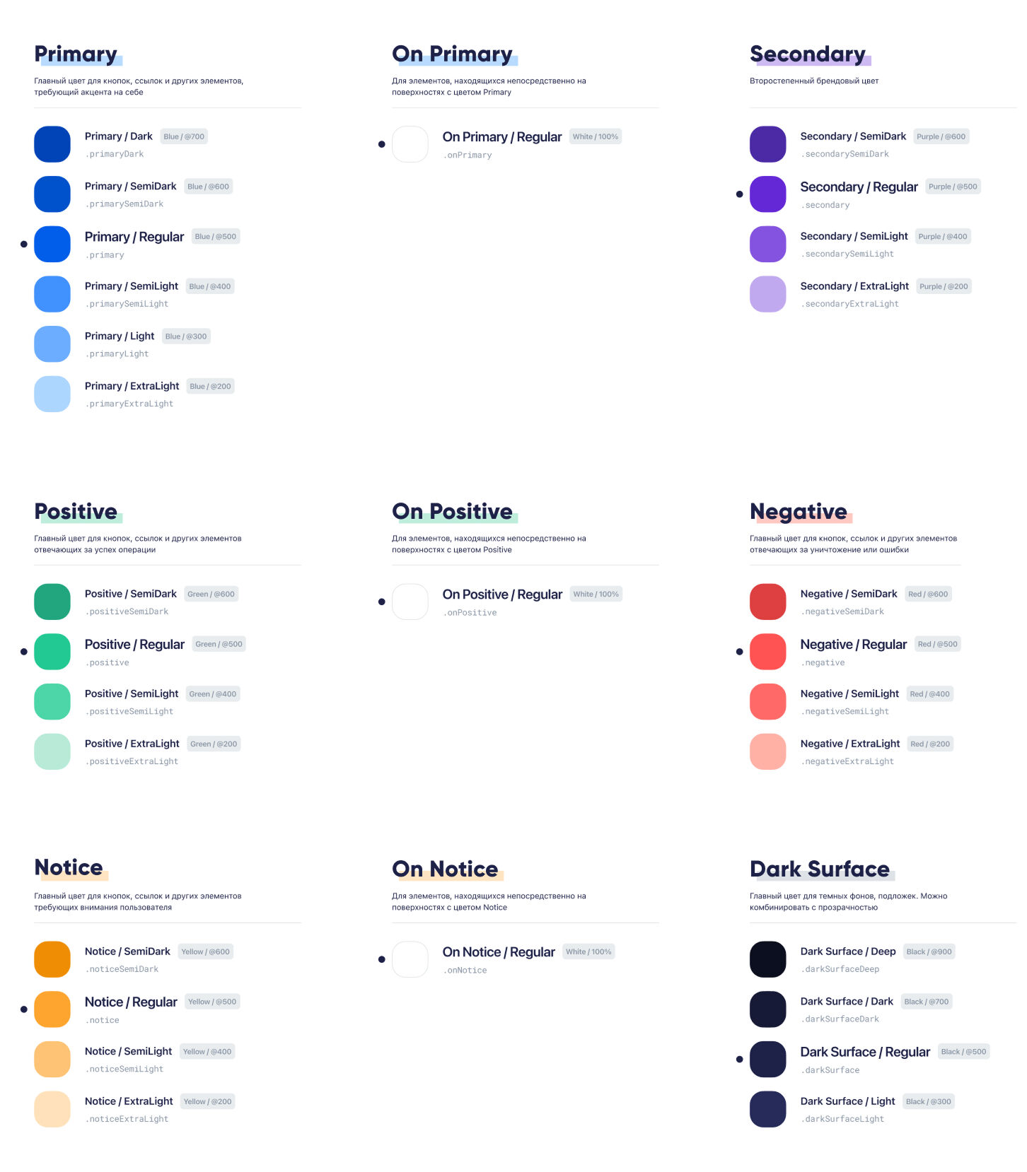
We began with a full interface audit — mapping every color, component, and layout pattern in use. This revealed massive redundancy and gaps in accessibility.
From there, we defined design tokens for color, type, grid, and spacing — the DNA of the new system.
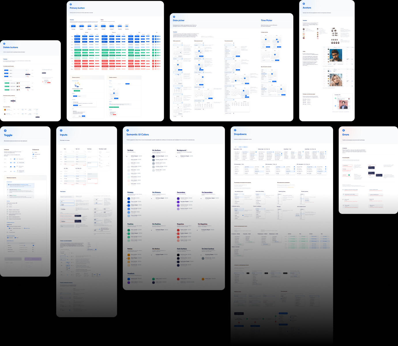
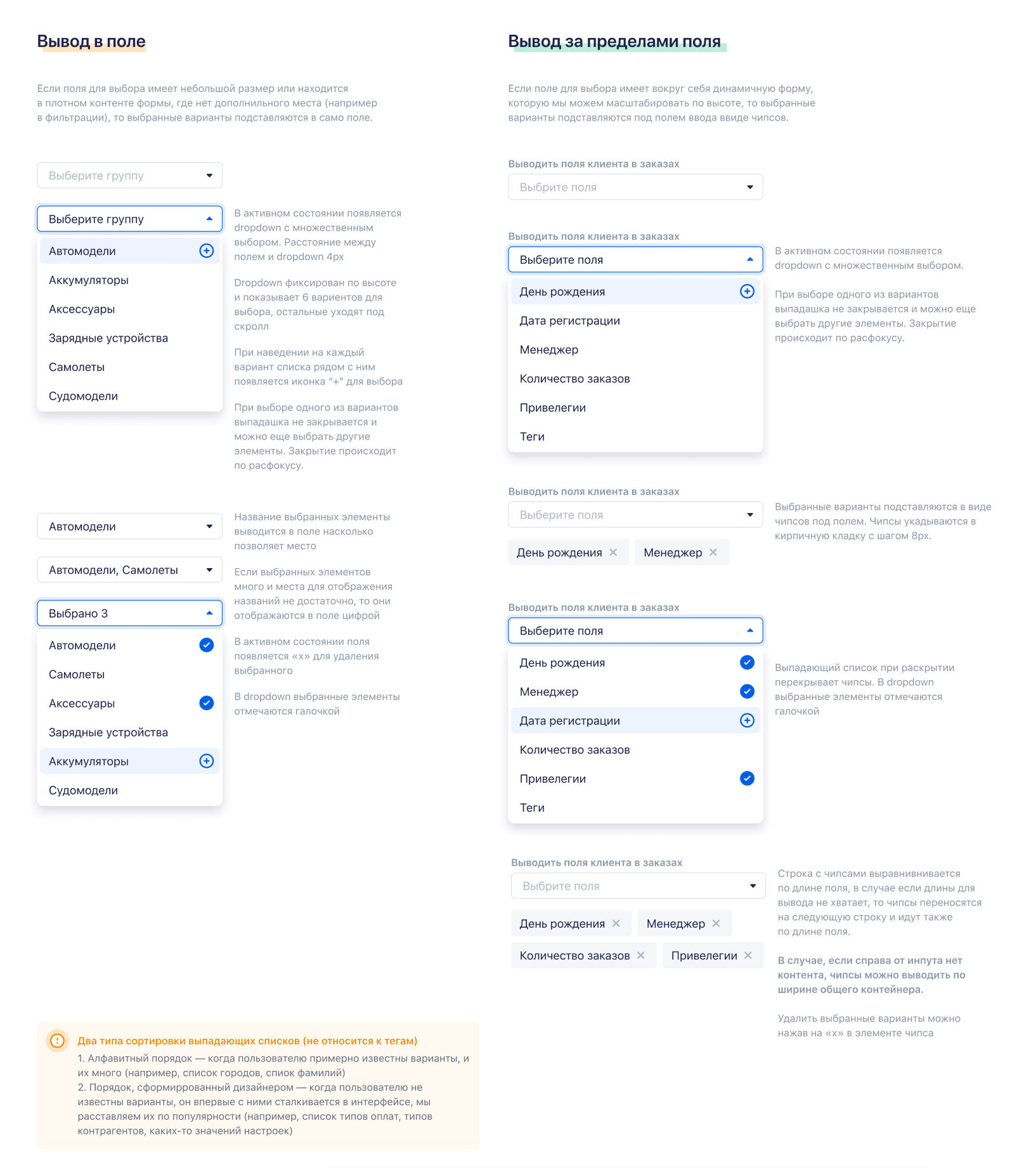
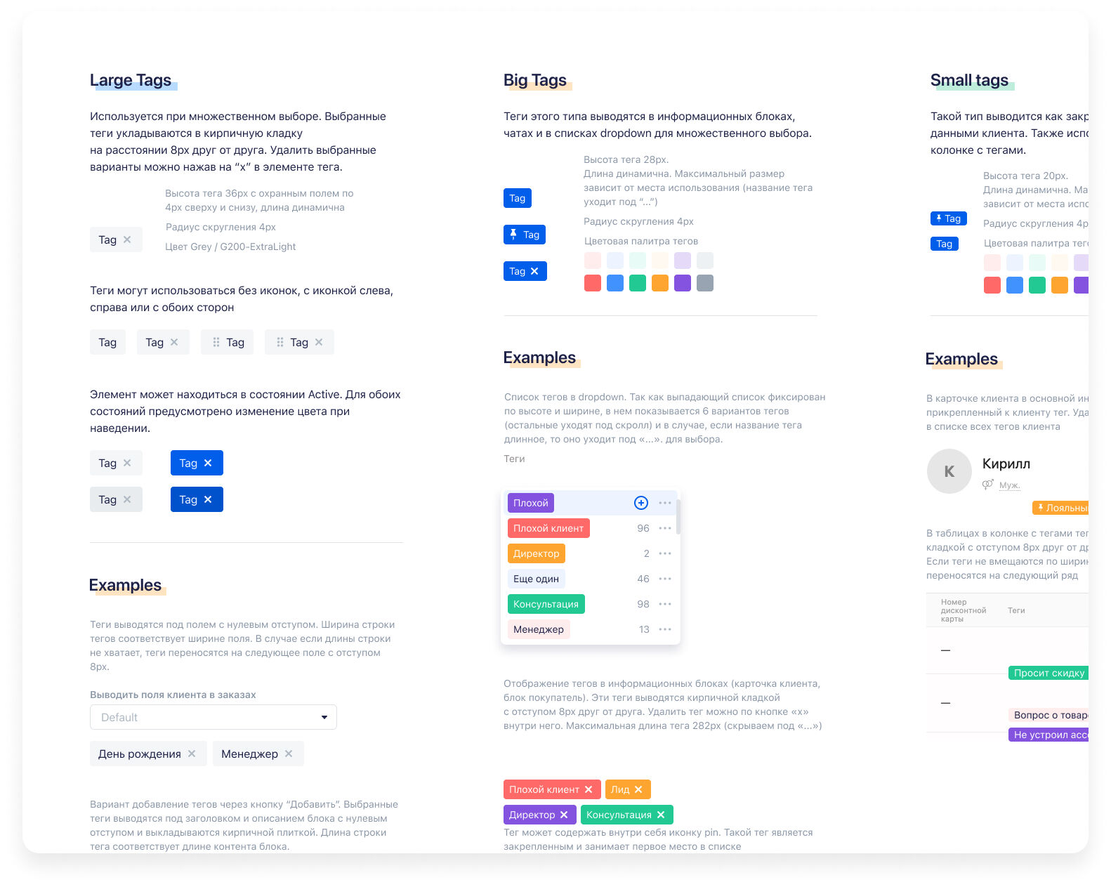
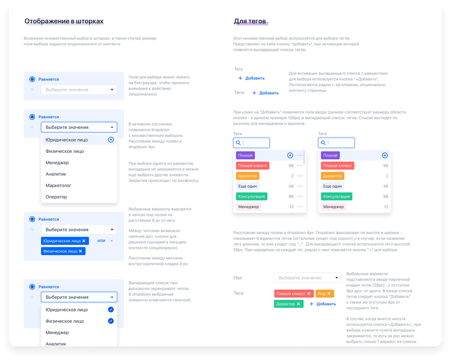
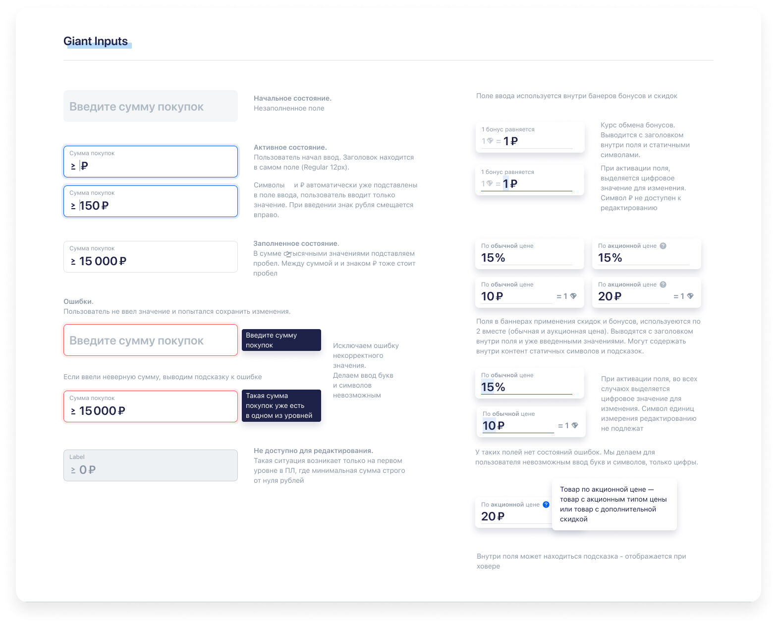
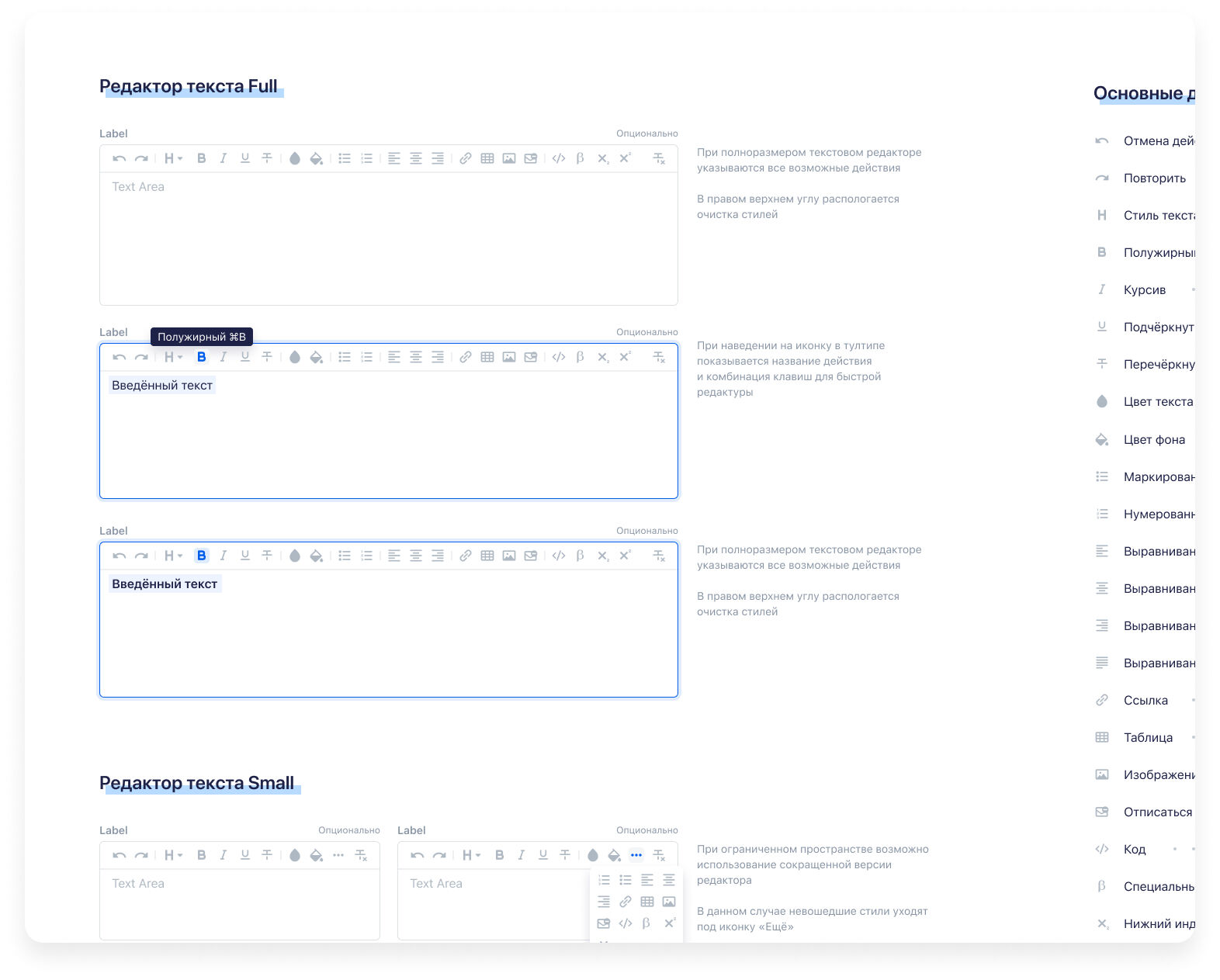
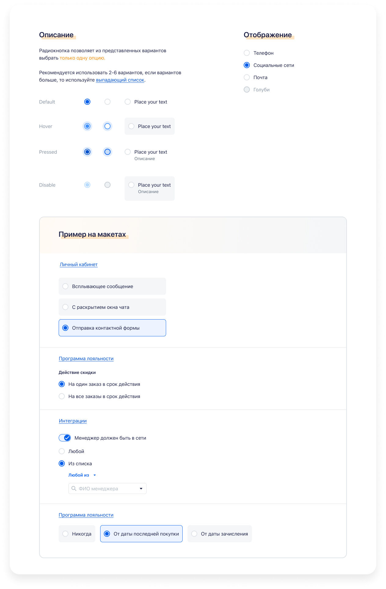
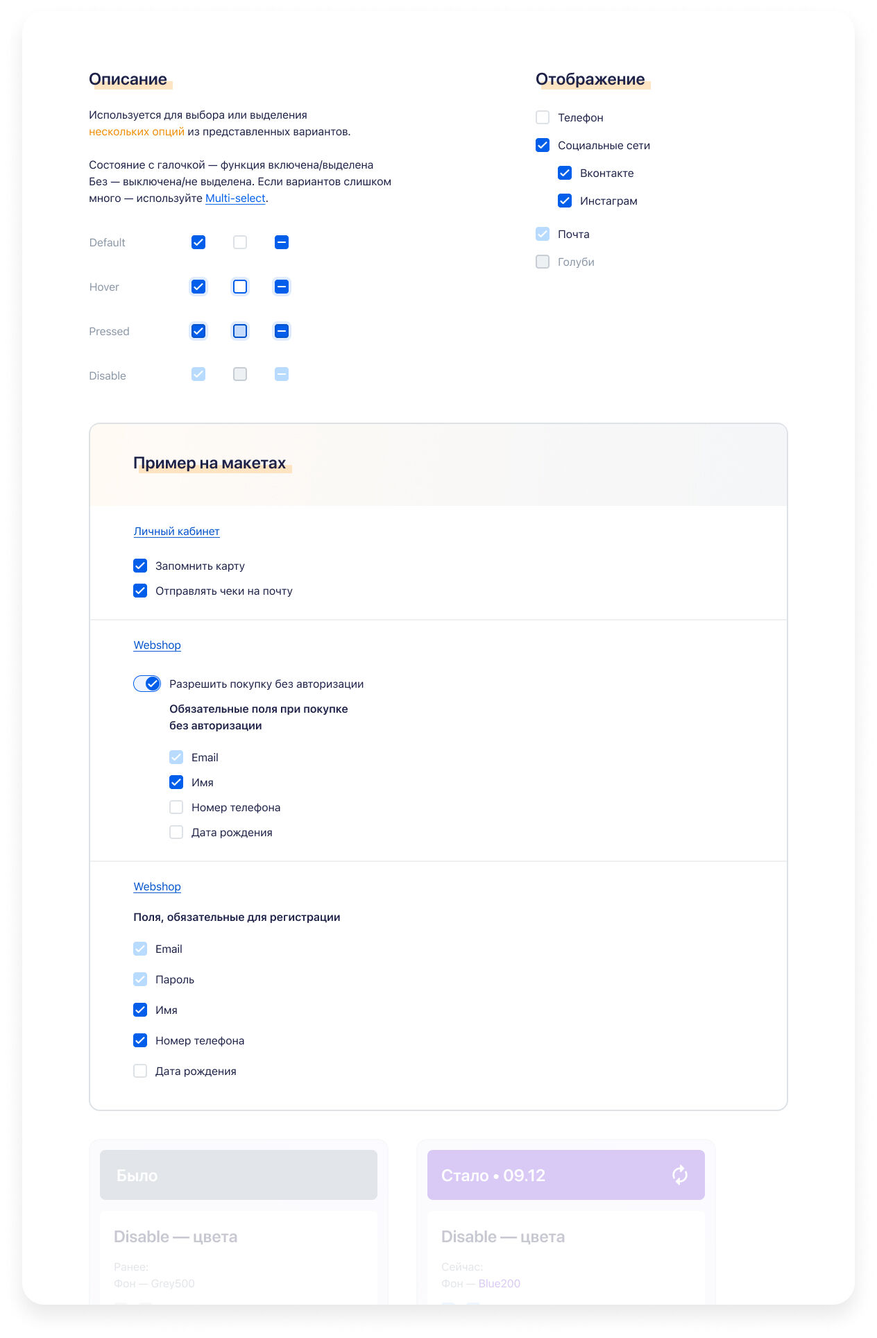
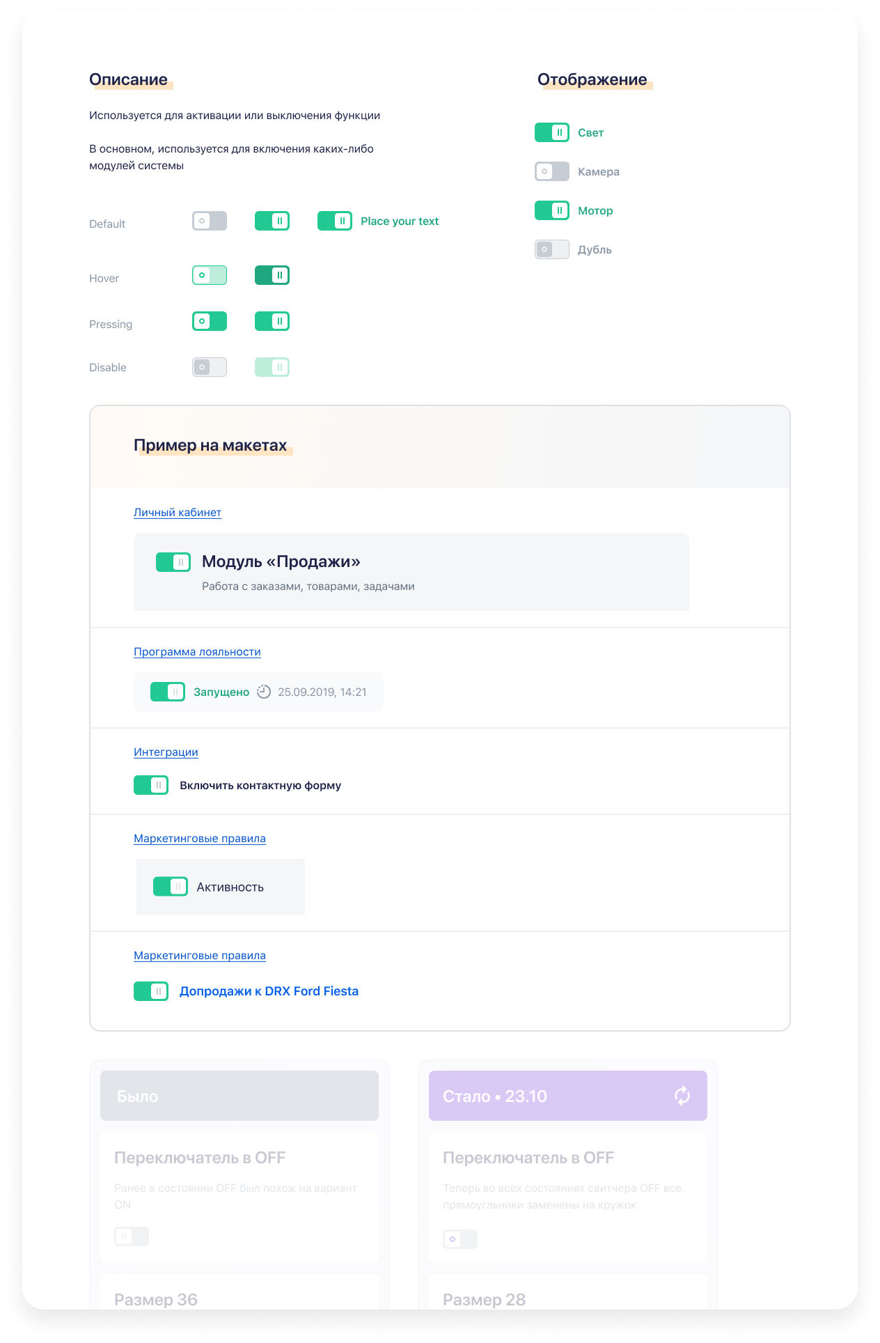
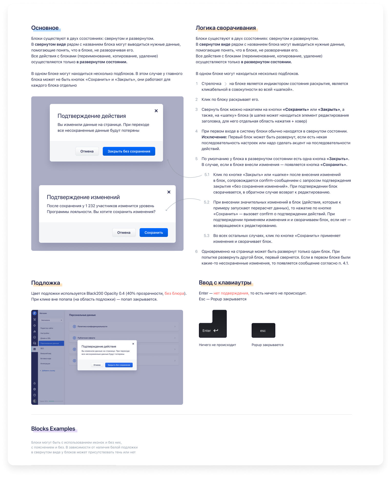
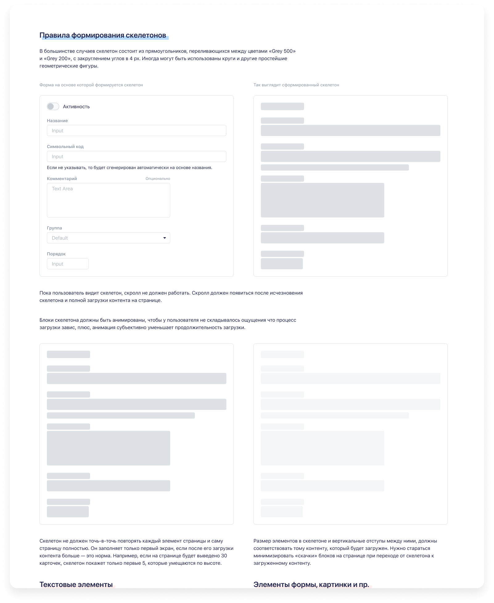
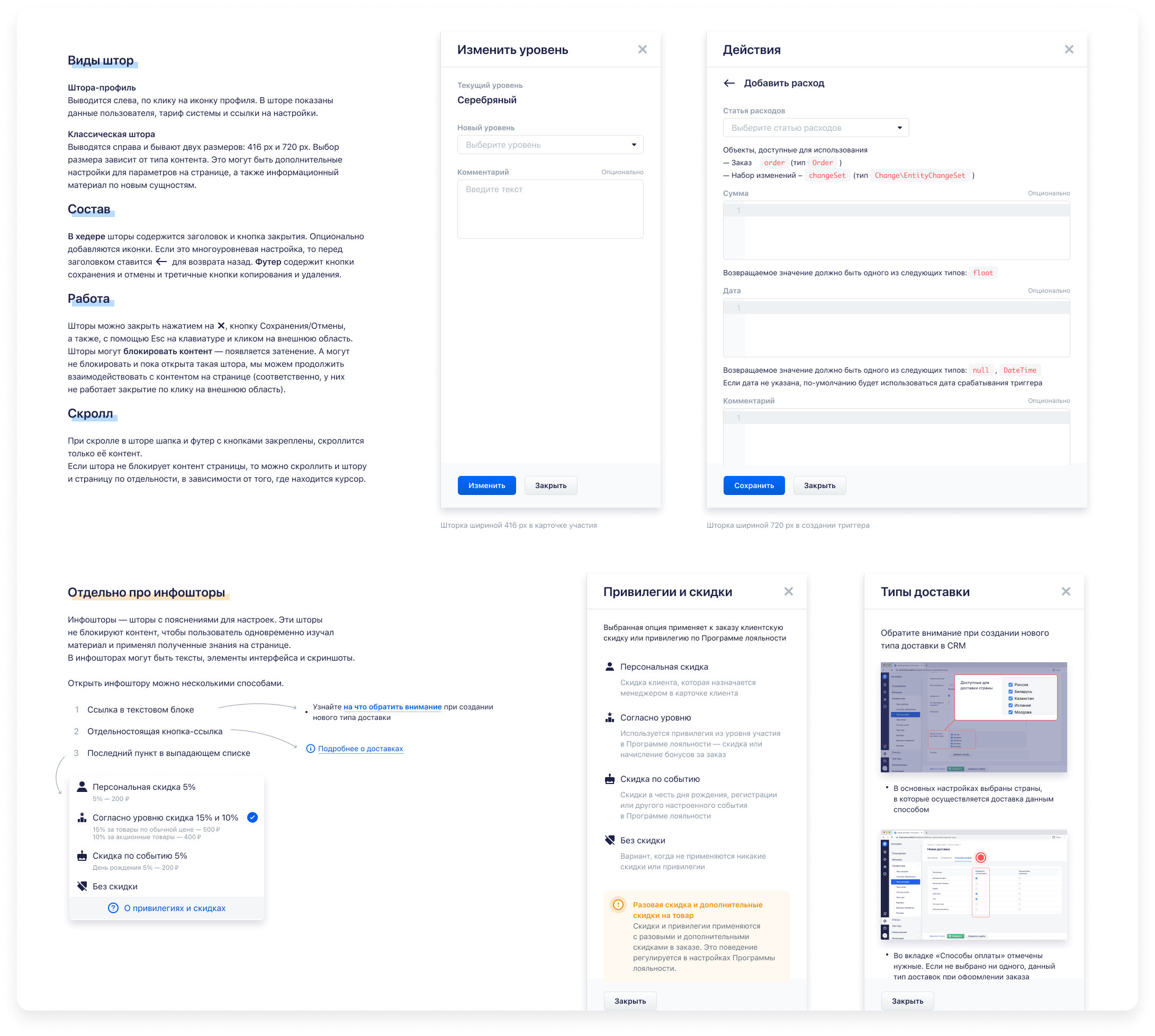
Component Library
Built 100+ standardized components in Figma and synced them with code via Storybook.
Each included usage rules, accessibility notes, and states for edge cases.
Integration of The Great UX Laws
Instead of relying only on classical cognitive rules (Fitts, Hick, Jakob), we adopted a broader internal UX doctrine:
- Clarity first — define the real problem before drawing.
- Consistency and sequence — keep users focused on a single clear goal per screen.
- Progressive disclosure — reveal complexity gradually.
- Error-proof design — prevent failure states rather than explain them.
- Human tone — interfaces speak the user's language.
- Aesthetic empathy — visual comfort builds trust.
- Personalization — interfaces adapt to user context, not the other way around.
These laws became part of every design review and product kickoff.
UX Writing Guidelines
Developed an editorial policy for all in-product text:
- Simple and direct syntax: avoid complex participles, keep active voice.
- Helpful messaging: describe what happened and what to do next.
- Human tone: no jargon or artificial politeness — use everyday language.
- Error messages: clear problem + next step, no vague "unavailable" states.
- Consistency: button labels always action-oriented ("Create Order", "Ship").
- Formatting: proper usage language specific symbols, non-breaking spaces, typography rules for numbers and symbols.
This guide became part of the documentation portal alongside UI components.
Governance & Adoption
Established design system versioning, changelogs, and contribution rules to ensure consistent updates and maintain quality standards.
Trained all designers and developers to use and maintain the library via onboarding sessions and code-review rituals. Created comprehensive documentation and guidelines that made the system accessible to both new team members and existing contributors.
The governance model included clear ownership, review processes, and deprecation policies, ensuring the design system evolved systematically while maintaining backward compatibility where possible.

Outcomes
- UI defects reduced by 95% across all new releases.
- Feature delivery time shortened by ~30%.
- Design and dev handoff became predictable and repeatable.
- Introduced shared UX Laws and writing principles that guided every new product decision.
- The system became the visual and behavioral foundation for all future RetailCRM and Simla.com interfaces.
Key Takeaways
A design system succeeds when it defines why and how decisions are made — not just how things look. Codified principles (UX Laws, writing guides) make scaling design effortless. Proper governance and documentation sustain quality as the product grows.